
Digipak
- Patri

- Apr 11, 2019
- 4 min read
Updated: Apr 21, 2019
After doing research on indie digipak designs, I decided to take photos of Eden on the setting of where the music video takes place in order to create branding and fluency.
-Front Cover:

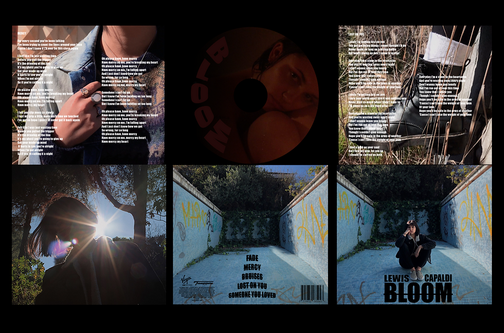
I decided to use this photo because it represented the indie look that I was looking for. The way she is in the middle of the frame inside a dry swimming pool full of graffitis, symbolises the laid back look that most indie artists look for. This also targeted our audience as it is juvenile and eye-catching due to the contrast between the blue and the yellow. The fact that she is wearing dark clothes links to the fact of it having fluency all throughout as the main colours are black and white just as her shoes. In the background there are plants that have been growing without anyone noticing. This symbolises how their love has grown but it has come to a point where it has started to surpass certain limits, just as the plants have gotten inside the swimming pool. The use of shadows is very important as half her body is in the sun and the other half isn't. This links to the lyrics as it suggests how the bad was starting to eclipse the good. I used photoshop in order to add the lettering. I used a typical font (Impact) all throughout the digipak. For the tittle I decided to put a line through it in order to make it look more put together and differentiate it from the name of the artist.
-Back Cover:

The back cover was much more difficult to design as it had to follow certain conventions. For example it had to be linked to the front cover, in order to make it aesthetically pleasing by having a link with the colour scheme, showing continuity. For the illustration I decided to erase Eden from the same image that I used in the front cover with Photoshop. It was a long process due to the lighting as she was sat right in the middle. Moreover, the bar-codes are a typical convention of the back design of the digipak as it shows the authenticity of it and it helps count how many copies were sold and where they were sold. The credits are also another convention which name the companies that helped to produce the CD and give them recognition. The track-list follows the same type of font (Impact) with a line striking through it. I decided to not list them with numbers or letters in order to give a more rebellious and indie look. They are a little bit curved to create depth as the swimming pool looks like it is moving towards the buyer and dragging them inside the world of this new album. Moreover, the songs are listed in a pyramid like figure from the shortest tittle to the longest one. This is done on purpose in order to eliminate discordance from the composition.
-CD:

One of the main conventions of CD covers is the way they link to the digipak by using the same colour scheme. I think that the consistent font use and relating it to the artist itself either by writing their name or using an image of them makes it looks very professional because it illustrates how the artist creates branding through out all the products. For female artists, there isn't a pattern which correlates between the sex of the artist and the design of the CD. I also found that there are very few albums that have the artist on the CD. I decided to not follow this convention and add a photo of one of the most sexualised clips of the music video with a blurry background and Eden's knees tucked under her chin looking straight into the camera. The lighting looks natural (only lit by candles and a warm spotlight). Her hair and face are wet in order to enhance the reflection of the candles are sexualise the image. I used photoshop in order to cut the image to the size of the conventional CD and used a black side-ways fade from left to right. In this part I had decided to add the name of the album curved (just as in the back cover) but this time without the line as it didn't look good with the set up of the interior of the digipak. I decided to use a dark colour that is in harmony with the tones of the photo, in this case a dark red that integrates the word into the photo.
-Inside Images:


I decided to use this two images that will go on either side of the CD when it is totally open. This two photos are very simple and have the same tones as the other ones. I followed the convention of adding the lyrics of two of the songs in the album. The font is the same (Impact) but this time I decided to put it in bold in order to make them stand out even more from the background images. Once again I'm following the colour standards as I am only using black and white in all the typography used.

This image is the first thing you see after opening the front cover. It is very symbolic as the only thing you can see is the silhouette of the main character of the music video. This shot had to be retouched with photoshop as I didn't want to have the house that was filmed in the original clip. As the music video is all about the aesthetic and making it pleasing to watch i decided that the first thing for the buyer to see must be a pleasing image. Below I leave a video of the process speeded up to x2300.


Comments